Wednesday 2 February 2011

SkateBoard Design


I Created A joypad and overlapped in various sizes to create a skateboard design. It look very stylish and contemporary.

Front Cover Illustration


 My Illustration Which Is Used On My Magazine Design.

Carry On Posters


A Revamped Design Of The Carry On Posters.

Expressive Type


I came up with the idea for the type by brainstorming possible scenarios as to why the woman is frightened. Its a spider fitted very well.

Sunday 30 January 2011

Garfield Type


Handmade type using Felt + Fineliner. 
Character - Garfield 
Typeface Name - "I really hate Mondays"

T Shirt Designs Using 8 Shapes


Five T Shirt designs created using only 8 shapes i was only allowed to merge the shapes not alter the width or height unless its scaled to size. I Created 5 t shirt designs aroun 5 mythed monsters.

Book Jacket Design

For my book jacket design i was given the twilight series i wanted to create the image of a eroding Diary as the story of twilight goes darker after each novel. The lock also erodes after each book until the end its nearly black.

Friday 28 January 2011

Self Created Journal


Some of my favourite Pages from my Self Personal Journal I really like the variety of styles i used inside it.


My Summer Illustration

As part of my Summer Brief to help us maintain our creative thinking we had to design a t shirt about our summer. We then got them printed and wore them on the first day we came back.

Ransom Notes Type Experiment

 I created these 2 ransom notes based on batman the second ransom note has no image because of the fact the riddler likes to keep himself hidden and to remain a mystery. Im really please with the outcomes i think they look very smart.

Tuesday 25 January 2011

Milk Packaging Design


I created milk packaging and decided to aim it at the teenage market. their is development of ideas on the left and the finished outcomes on the right. I wanted to create a nice look and decided to simulate the illusion of a halfpipe by creating a consistent curve.

Monday 24 January 2011

The Beatles Poster


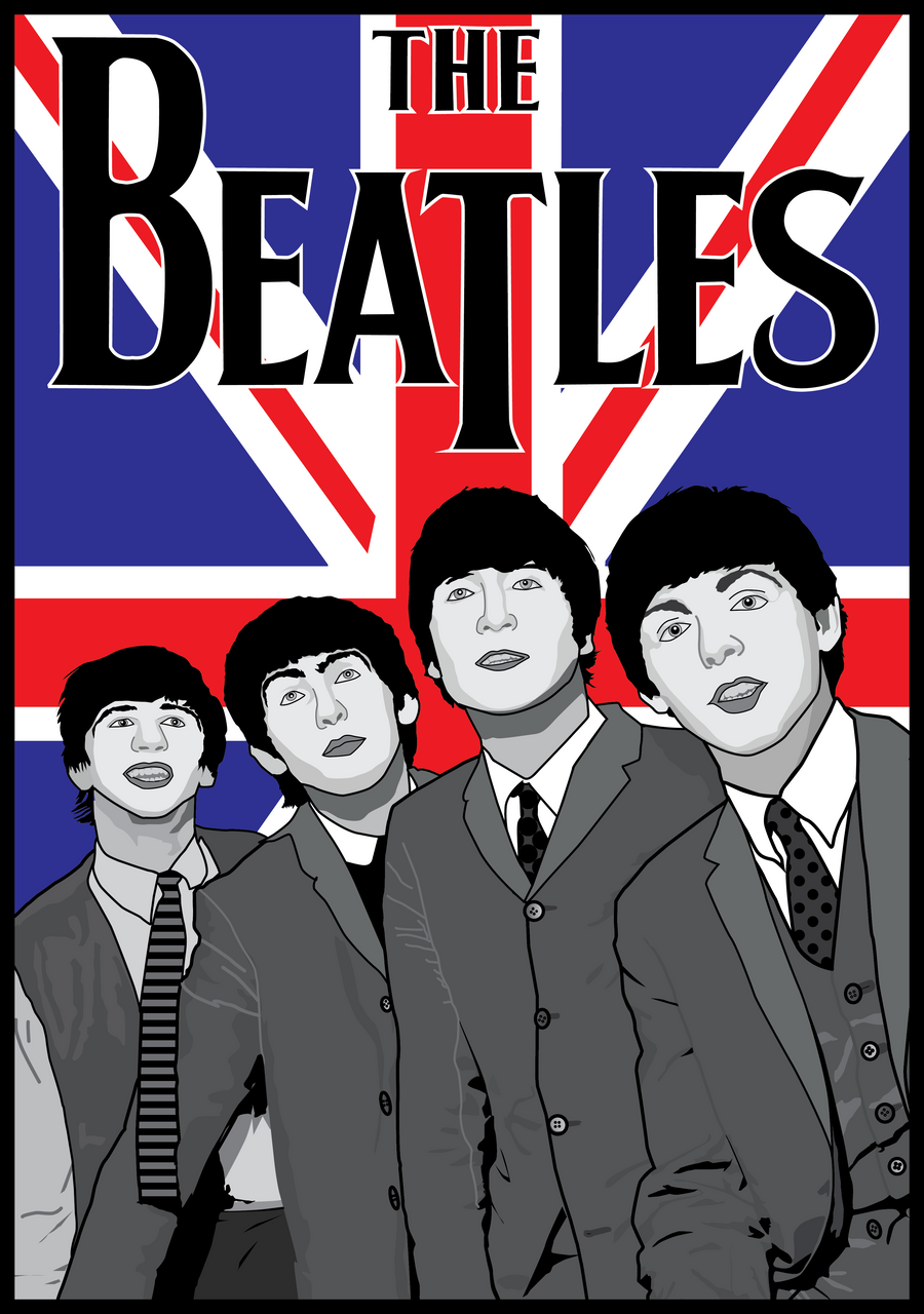
Personal Design of The Beatles, Took approximately 6-7 hours to create on adobe illustrator tracing a old photograph of the beatles. Im really proud of the finished oucome the mix of greyscale + Colour creates a nice impact and contrast between the beatles and the union jack.

Stationary Set Design


I was given a fairytale character to design a logo for and was given The Magic Mirror from the snow white story. I decided to research more into the character and decided that he would work well as a antique merchant so i decided to create his identity as Magic Mirror Antiques. I created a classic traditional design to help with the simplicity of the logo with a old style mirror. I created a repeat pattern for the stationary set i thought this created a nice impact and decided to keep the greyscale aspect in the overall design. The Buisness card has a impact of symmety with the front and back being the same and the only change beind what type is in the mirror. I really like the finished outcome and feel it creates a nice impact.